Fresh Paint
Saturday, April 03, 2004
SAIC BFA Show (Part 1)
Before I forget, some impressions:
One of the reasons I like this show so much is that I get to see a lot of art I generally don't like, and find I like it after all. And that much of what I claim to like a lot, I find boring. That is, I claim to like painting a lot, but much of what was at the BFA show was only mildly interesting (am begining to thoroughly tire of the 12 inch by 12 inch format, though that's about all I did last year myself.)
The show was packed, and I mean it. 3 complete floors of stuff -- everyone gets about an 8 by 8 foot space to do with what they like. I got there about six and had only made it through once (quickly) by the time we got kicked out at 8. And there was still a hoard waiting to get in and a line stretching around the block, one security guard trying to explain that everyone could come back tomorrow. (but they won't have the tortilla chips and pepsi tomorrow, i cried to myself).
I jumped up and down a little because I saw no Barbie art (little girl nonsense, I'm sure perfectly valid in a post-feminist art world, etc., yada, yada, but for years there was so much of it.) Only a few really self indulgent installations mimicking a corner of a teen's room, relationship stuff, etc. or guy stuff, exaggerated cartoons, and so on.
Saw no political art whatever, none. No one was wearing any political buttons at all. Very little cultural diversity either.
When art students dress up, the result is joyful. In fact, some of the strongest work this year was from the fashion students. Maybe because I'm knitting obsessed, but a haunting piece was a knitted sweater, skirt, and scarf in bright, cheerful colors with beading at the edges so heavy you never could see through, burka-like. Such contradictions. Made me think of different cultural associations, climates, etc. When I go back (it's up till the 16th) will find the designer's name.
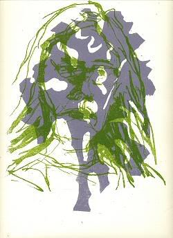
While much of the painting was of the meat-and-potatoes variety, many of the works on paper, especially graphite drawings and prints, was superb.
A lot of installations this year, and I couldn't get near most of them to see what they were about. Much less computer stuff this year than in other years, unless it's been moved to a different location. Some video (some of which was supremely awful), some animation. All of it very loud (there were sound pieces too, without headphones available).
Another observation: in far too many cases, the peripheral materials (buttons, business cards, postcards, little poems, I don't know what all else) seemed to overwhelm the art itself. If you could actually find it. In one installation, I'm beginning to think that was actually the entire point (buttons, posters, t-shirts, cds, tapes, stickers, whatever) -- trying to think if there was actually any content... hmmm. Will check when I go back.
Almost an inverse relationship between amount of self-advertising crap and quality, at times. For quite a few artists I liked had no business cards or other take-away items to remind me who they were, so when I go back will have to remember to bring a pencil. The School should have a fund for students who can't afford to have at least something.
Here are a few interesting artists in no particular order who did have business cards so I know who they are:
Amanda Freund -- thousands of paint chips, ink jet samples, etc. of names for the color yellow, pinned to the wall. From the typical (goldenrod, cadmium) to the specific ("Early Bruises"). A meadow of paint chips. Beautiful, and made you read and think.
Emily Lin -- gauze hanging from ceiling with little plants growing out of pockets -- beautiful piece of art, but practical as a room divider too. Artist statement: "In the Chinese history, red beans symbolize missing someone... It also reflects the state of self growth to become a mature individual as the beans require nutrients to grow tall and strong."
Joseph M. Haugen -- animal sculptures -- rats playing tug of war, a deer head with blind eyes, very interesting footstools.
Michelle Ubben -- 3 blocky landscape paintings, compositions unusual, which is why they stood out. Deliberate brush strokes. Could have paid a little more attention to materials used, edges, etc., but pretty good.
Tara Smith -- one big designy painting all done in a girly pink floral pattern. One of those paintings I always say I don't like, but I loved this -- simply well done.
Will go back maybe Wed. this week and do another installment. There are so many more to talk about.
 This work is licensed under a Creative Commons License.


