Fresh Paint
Sunday, April 10, 2005
SAIC BFA Show -- Third Floor, Part One
Preliminary Note:
If I didn't notice your work, don't be upset. There were nearly 300 exhibits. Some things I simply have no feel for -- most photography, sculpture, jewelry, architectural stuff, commercial art, video, for example. Sorry. I may have missed some things while following the circuitous path. And yes, some of it was just not worth writing about. You can email me before the show comes down if you think I missed something worth looking at and maybe I'll go look for it. Maybe not. This is the real world, after all.
So. My prejudices are painting, printmaking, works on paper, and delightful things in general. I have a fondness for fashion and fiber art, too, as you all know.
Let's get started with the Third Floor, in order of viewing:
Victoria Troshin -- mixed media. Mylar? Skin? Blood? Tea bags? Multilayered translucently thin objects pinned to wall, captured in plexi boxes. Some delicately drawn on. Bones? Lovely.
Seema Dhoud -- triangle paintings of partial views of faces. Of moderate skill and interest, except note on wall says the artist is working on oil ground manipulation. Looking closer, then I see that the most effective one has many wrinkles under the painted image, all over the face area. Another has just wrinkles under the nose. Wonder if these are going to continue to "mature" as the drying time of the 2 different layers alters the image further.
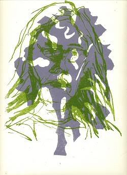
H. Oh -- really neat woodcuts, ok etchings. Like the alligator eating a little kittie.
Felicia Grace Cinquegrana -- first real showstopper piece. "'Tis the Season, 2005", a 15 (or more) foot tall sculpture, a xmas tree made of 1700 hangers (the white plastic and metal department-store type) hung in rows on a steel armature. Liked both the shape and restraint of the piece. She could have gone over the top and actually decorated it, or painted the hangers green. They give a sense of both the solidness of a tree covered in snow, and also a glisteny, silvery quality. The hangers move slightly in air currents.
M.V. Tobin -- pigmented ink on paper. Minimal landscapes. Also big scribbles on bigger paper. Nice contrast.
Hannah R. Simpson -- I'm not a jewelry person, but these silver pieces were beautiful. And really liked the silver knife, fork, and spoon set with marbles inlaid at the end of the handles.
Vanida Wechasethanon -- "You Should Really Smile More", oil/canvas. Like the composition, subject, etc. Execution is adequate. Would like to see more care given to facture. Image is others in the frame smiling probably at the camera, main subject (young girl, maybe the artist) just looking grim.
Jiha Lee -- "Composition in Ivy & Persimmon (Let's Get Lost)" oil/panel, 12 inch square. Seemed to be only piece this artist exhibited, and curious. In center is very detailed, heavily worked couple in a convertible. Some of the shapes opaque, edges firm, others thin and sloppy looking. Edges disintegrate further toward top of painting, as road leads into the woods, in foreground are hard as a rock. Wasn't sure what to make of these contradictions. How much intended vs. fortuitous?
Marisa Heilman -- another showstopper. Solid stuff vs. empty stuff. Ceramics vs. wire armatures. This is an installation that lingers and makes me think of all these things. A ceramic pair of slippers, amusing. A softly collapsing teapot on shelf. vase, other household objects. Displayed along with black wire contour sculptures of other household objects. And a "house cage", with printed fabric images of household objects inside -- curtains, chandeliers, etc. (weakest part of display. cool, but not strictly needed). Tiny circles of black wire strewn about, possibly drops of water or flower petals? Found this exhibit mindbending in that I wasn't sure what was flat and what was not.
Katya Meykson -- good paintings -- snow, dog. Really nice one of face (possibly of artist) looking down, head in hand. Another of washing dishes, reaching out and petting dog. Good, nice surfaces for a change.
Here endeth the first half of the third floor. More later.
 This work is licensed under a Creative Commons License.


