Fresh Paint
Friday, August 26, 2005
Landscapes Everywhere
I was afraid that I'd have no more interesting landscapes to look at now that Neil Welliver has passed away, but several recent shows (in particular those in West Loop Gate galleries) tell me that I have nothing to worry about.
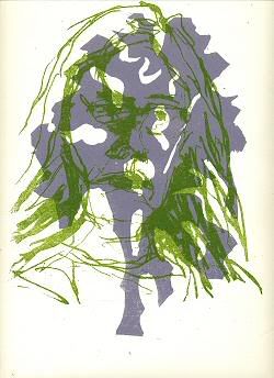
Last month (or maybe two months ago) a show at Wendy Cooper caught my eye -- pigment, pastel, acrylic, ink, stones, glitter, etc. etc. on paper by Kim Krans -- the richness of materials countered the spareness of tree trunks and desolate scenes (somewhat like Claire Sherman's).
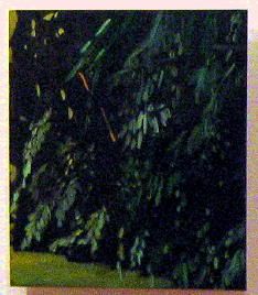
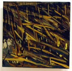
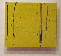
This month we have Claire Sherman at Bodybuilder and Sportsman. Two large paintings and a number of small studies on wood panel made up her part of the show.

She is good at telling you about a scene without being specific about it and ruining all the fun (unlike me, who always tells far, far more than anyone would humanly want to know). In each of her small paintings (I liked these more than the larger ones), she deftly notes the direction of the sun, the angle of the grasses, the spacing of the tree trunks, the criss-crossing of patterns that is an education in what to look for when painting a landscape.


Her surfaces are dense, horizonless, vistaless. She digs into the mass of forest and swampy water with zest. No animals, no birds, no humans, no romance litter these scenes. They are analytic and smart.
Across town at Lydon Fine Art are more landscapes -- a show called Summer Solstice, showcasing Elizabeth Elting, Tracy Lynn Pristas, and Mary Strasevicius. Elting does hot hot landscapes (she paints on a cad red ground) seen from overhead, fields and roads forming patterns we've all seen before but her painterly bravado can be breathtaking.
The other two painters I found far less interesting -- scrapey spiritual sun-shapes on large canvasses, etc (Strasevicius), or occasionally sick-making romantic canvasses from Pristas (with titles such as "Listening to the Muse"). They are pretty, in an impressionistic way, but are empty calories. Her catalog statement wins this year's Bad Art Writing Award, by far:
The combination of figuration and imagery utilizes dynamic colors to give the appearance of a strictly intuitive process, however my process of creation subsumes the underlying structure of a highly ordered format.Say what?
Finally, at Perimeter we find William Keland's paintings and works on paper. His large paintings have a touch of Burchfield to them that I like, and his craypas drawings are pleasantly mushy (I know what that's like). Each painting is a thing unto itself. Seeing them side by side, you keep checking to see if it's still the same artist, but in a good way.
That's it for now. Back later with a peek at the upcoming Gescheidle show.
 This work is licensed under a Creative Commons License.


